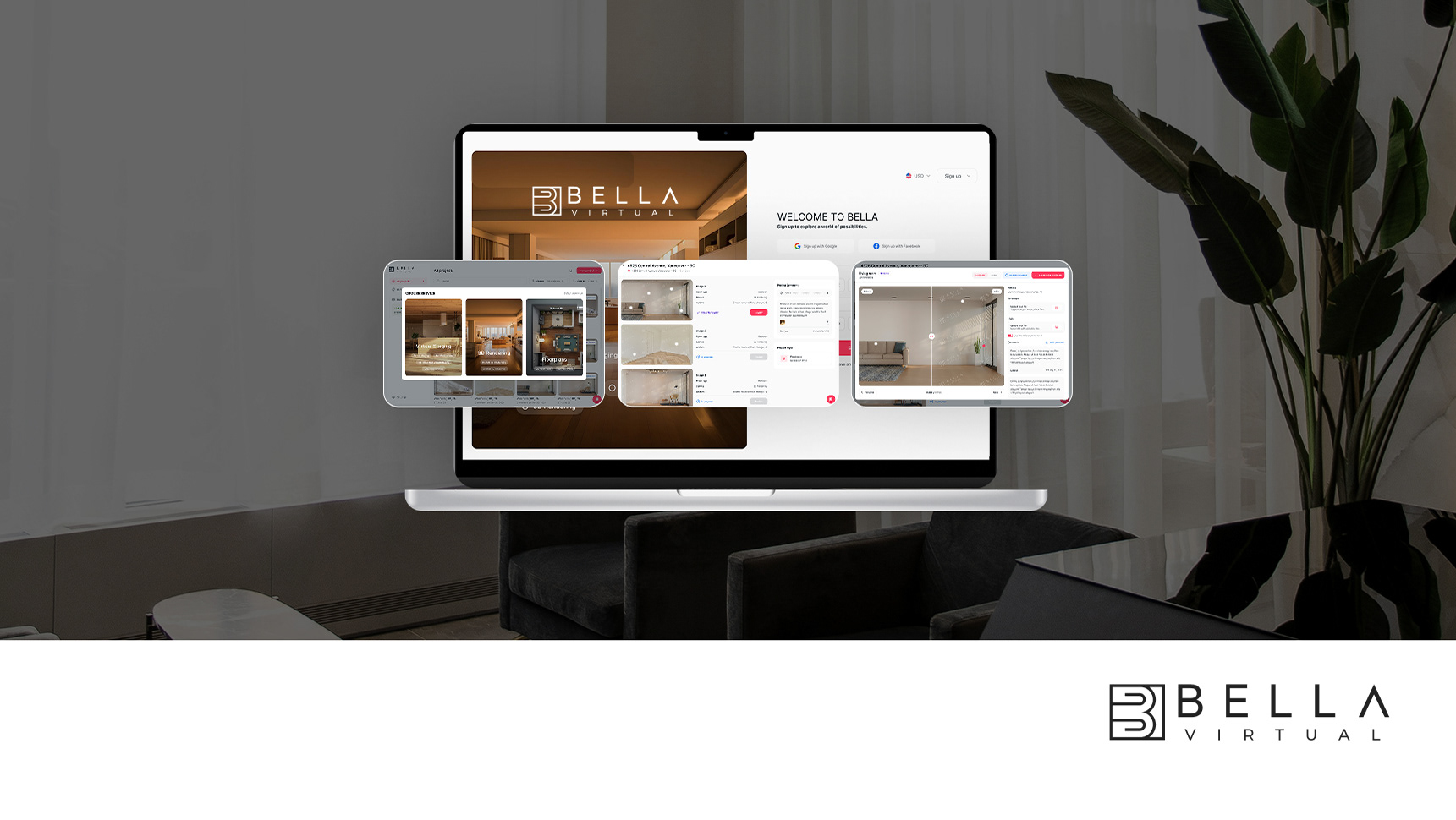
Product Lab Online Booking mobile is a scheduling platform.
Role UI/UX Designer — dashboard design for data visualization
Role UI/UX Designer — dashboard design for data visualization
Timeline 40 days from request alignment to final version design
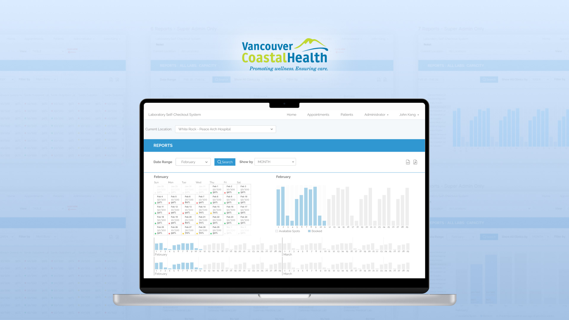
Industry Healthcare | Provincial Scale Platform: Web (staff-facing internal tool)
Industry Healthcare | Provincial Scale Platform: Web (staff-facing internal tool)
Note: All mockups shown here are screenshots of early-stage drafts used in the development of a real system. Names, numbers, and other text content have been altered for confidentiality and do not reflect the final delivered product or any real individuals or institutions.
PROJECT OVERVIEW
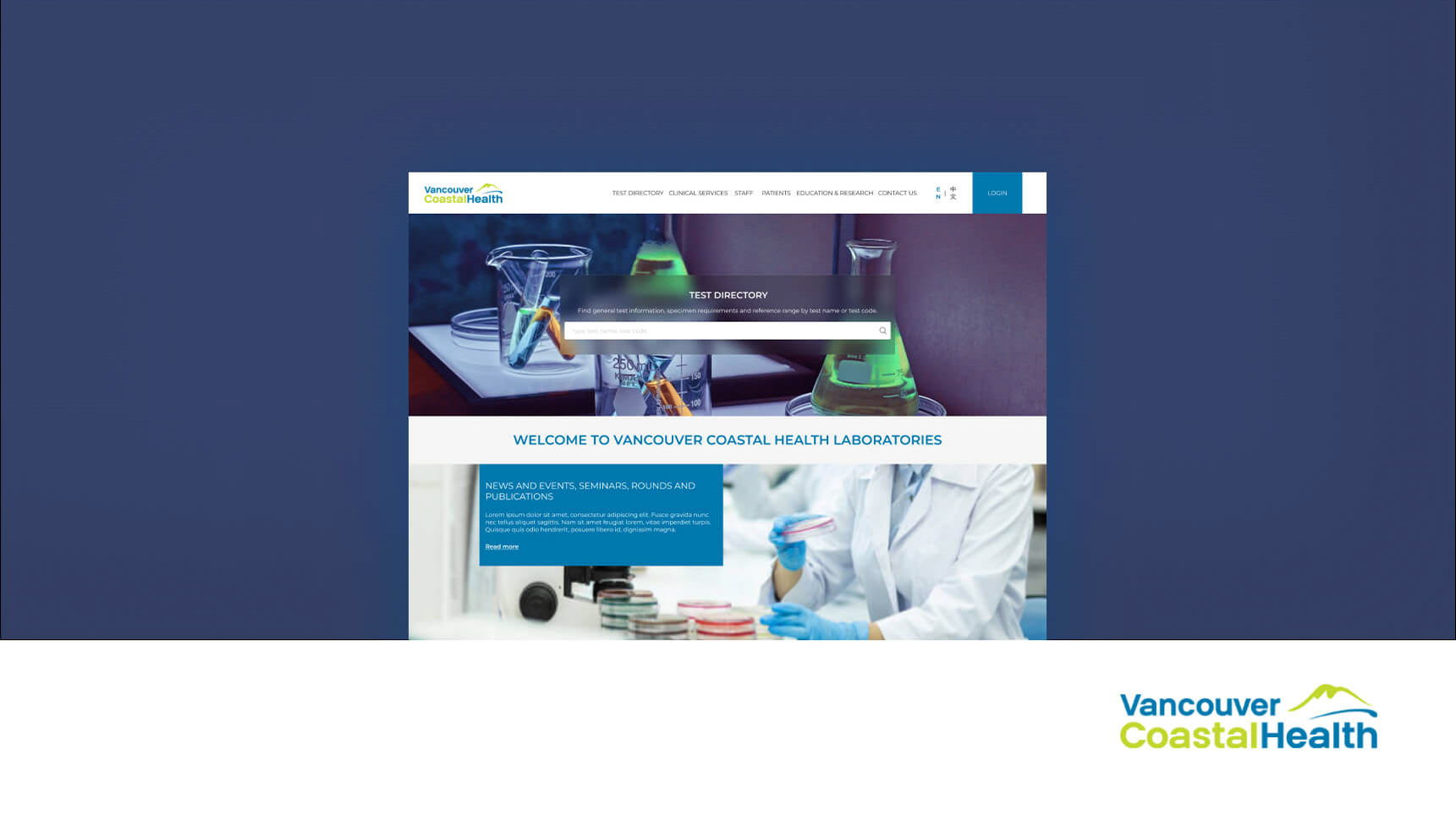
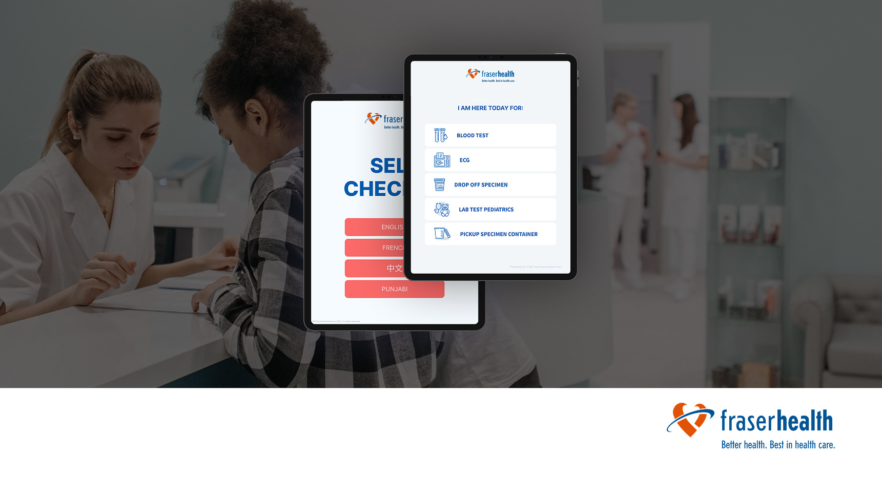
Lab Online Booking is a provincial healthcare scheduling platform operating across British Columbia — serving major health authorities including Vancouver Coastal Health, Fraser Health, Providence Health Care, Interior Health, and Island Health. The platform has processed over 3.6M bookings and supports 900 patients per week across 70 clinics.
I joined as a UI/UX Designer contributing to the analytics layer of this platform — a staff-facing dashboard designed to give healthcare administrators real-time visibility into booking patterns and clinic load.
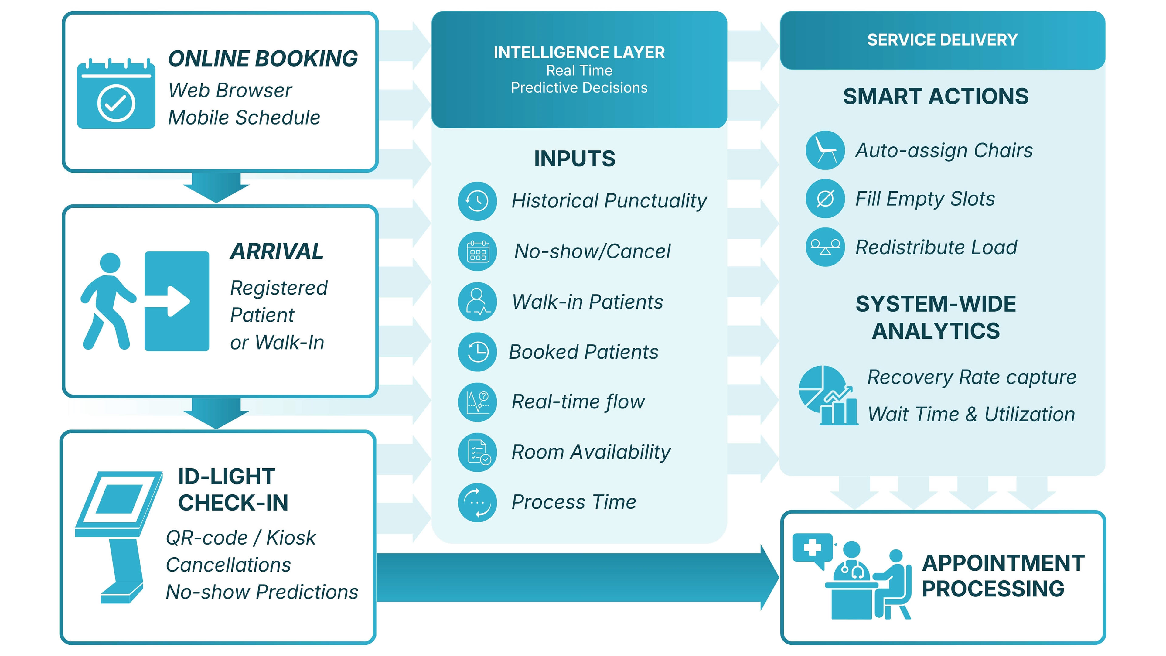
Real-Time Patient Flow Optimization Engine
THE PROBLEM
Staff across 70+ healthcare facilities had no built-in way to monitor appointment flow. The only option was manually exporting raw data and seeking external analysis — a process that was slow, error-prone, and completely unusable during high-demand periods like flu season. Decisions about staffing and scheduling were being made reactively, often too late.
What I Did
I redesigned the dashboard experience from the ground up — reorganizing information hierarchy to surface what staff actually needed first: current occupancy, weekly load trends, and capacity forecasts by lab location. I designed data visualization components that translated complex booking data into digestible patterns for non-technical clinical staff, and explored AI-assisted forecasting concepts to help administrators anticipate surges before they happened. Accessibility and clarity for diverse staff groups guided every decision.
Requirements / Pain Points
Healthcare staff struggled to manage and prioritize appointments efficiently.
Dashboards were overloaded with information and lacked clarity.
Seasonal peaks (e.g., flu season) made staffing unpredictable.
Limited predictive capabilities to forecast appointment surges.
UX Approach
Focused on improving dashboard clarity and data visualization.
Explored ways to integrate AI-driven features to predict patient load.
Balanced usability for non-technical staff with robust functionality for admins.
UX Actions Taken
Reorganized dashboard layouts to surface the most critical information first.
Designed data visualization prototypes to illustrate seasonal patient trends.
Created workflows that highlight urgent cases and flag staff allocation needs.
Explored AI-assisted suggestions for appointment scheduling and overload prediction.
Considered accessibility standards to ensure clarity for diverse staff groups.
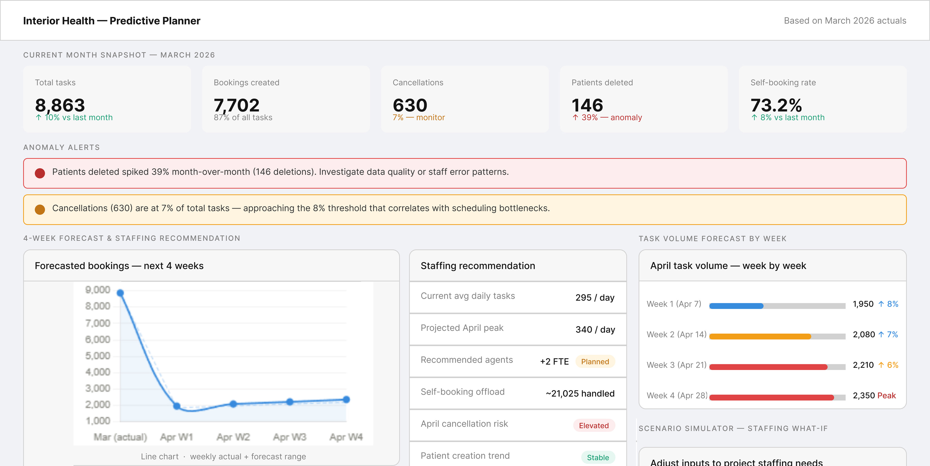
Staff Dashboard Wireframes to Illustrate the UI - staff dashboard upgrade 2024
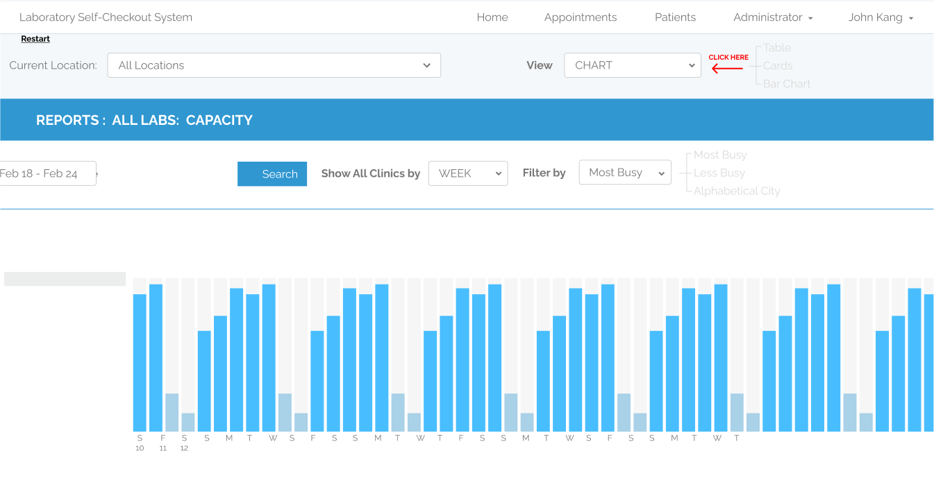
Lab Capacity Overview
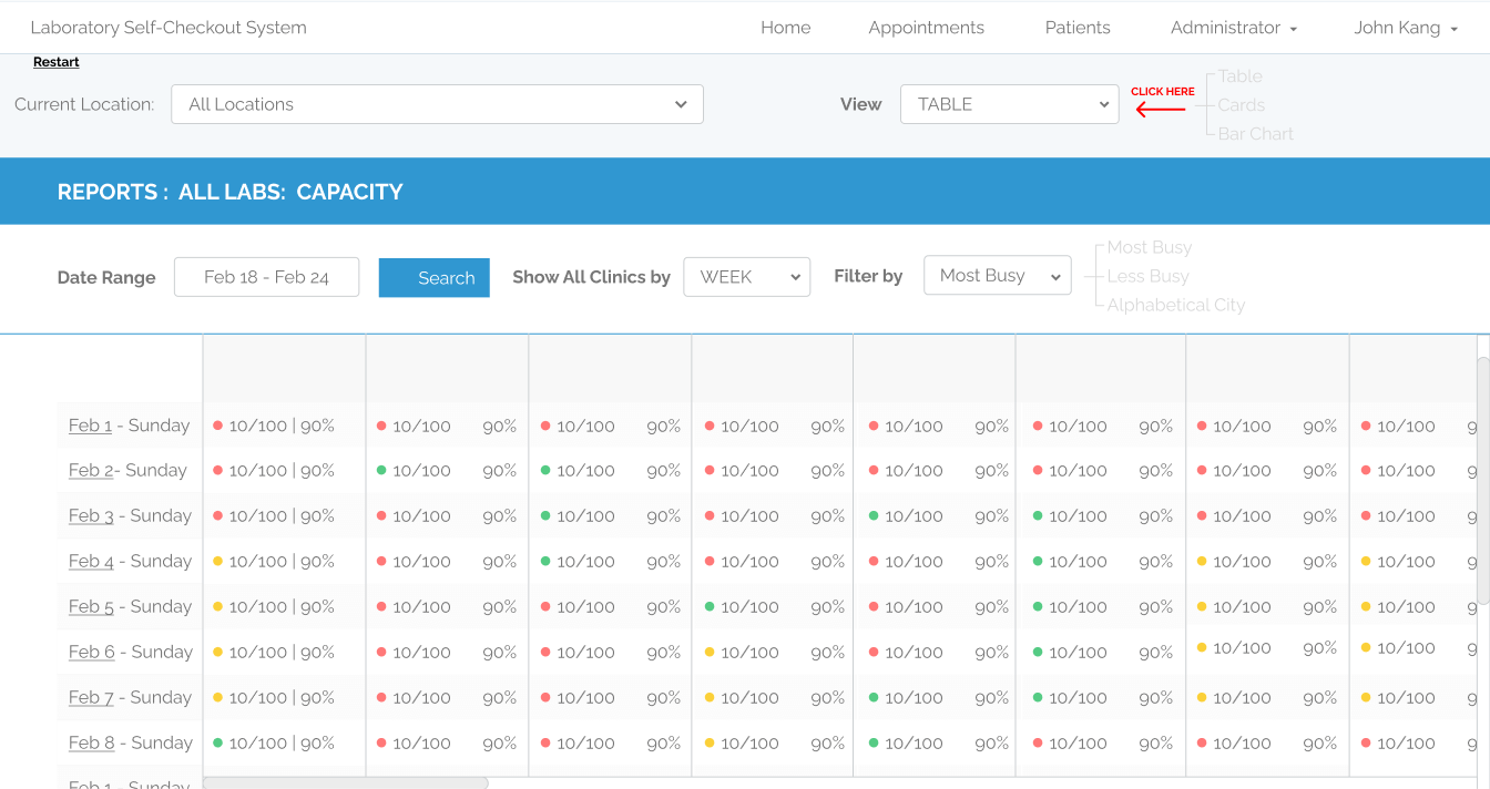
Labs Current Occupancy
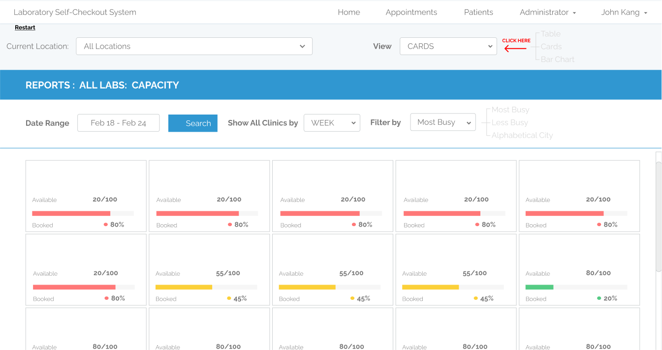
Occupancy view by Week
LOB Staff dashboard evolution
2020 - no dashboard: Staff had to download CSV files
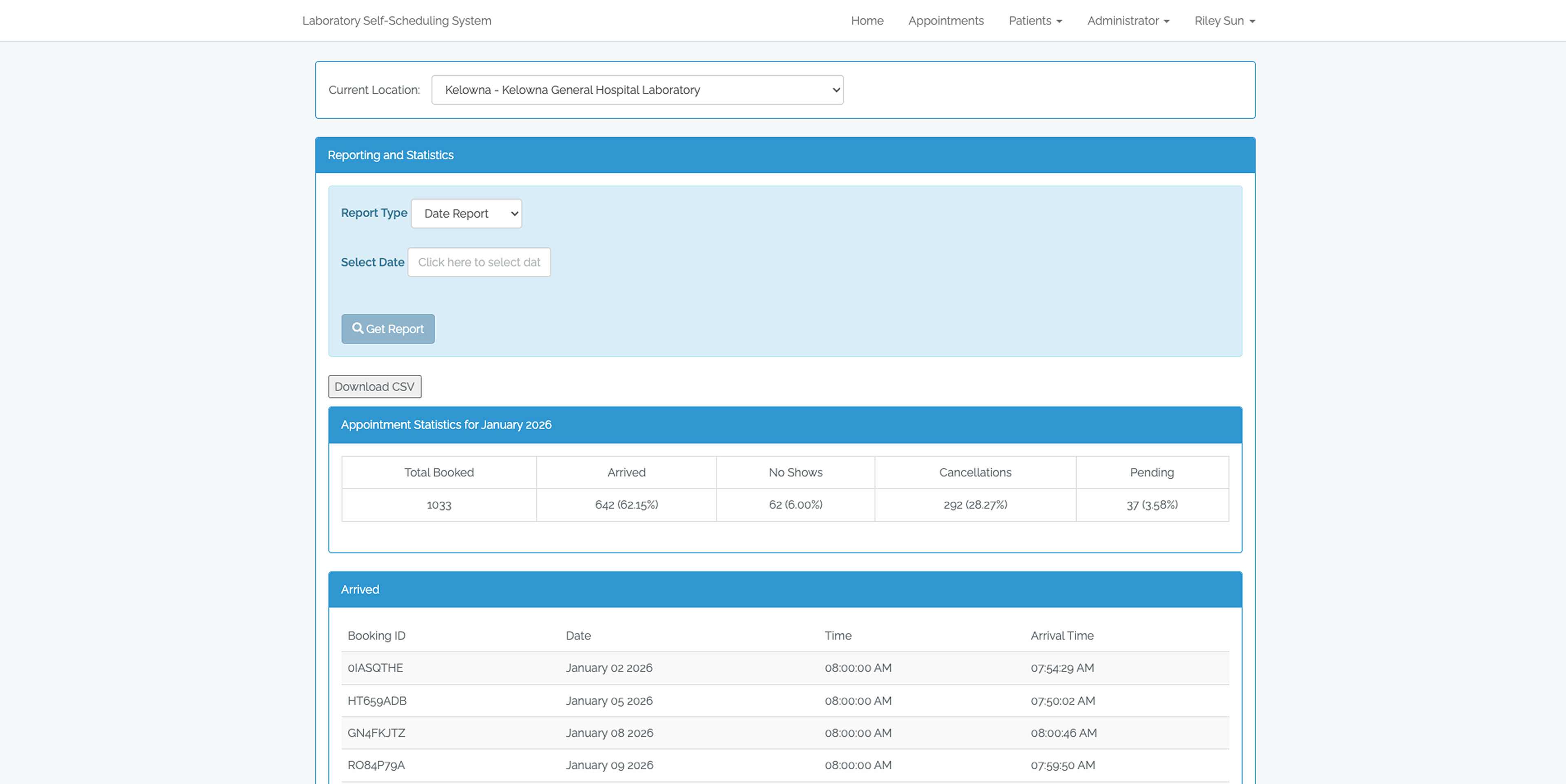
2025 - Visual Interpretation of Data by Color Code Highlighting Totals

2026 - Graphic Visualization with Totals interpretation and Comparisons
Impact
The redesigned dashboard was deployed across 70 clinics serving Fraser Health, Vancouver Coastal Health, Vancouver General Hospital, and Provincial Health — enabling same-day operational decisions for the first time without requiring data exports or external analysis.
Conclusion
Through improved dashboard organization and predictive design concepts, the system could reduce appointment bottlenecks, decrease average patient wait times, and improve staff scheduling efficiency. Even without measured data yet, the redesigned experience aimed to enhance operational efficiency, resource planning accuracy, and user satisfaction.
art direction and design for marketing team
Marketing & Print
- Brochure templates
- Listing flyers
- Magazine ads
- Bi-fold LOB materials
- Branded PowerPoint deck (buyer segments)
- Brand & Identity
- Logo and brand guidelines
- Typography and color system
- AI tool suite branding
- Video reel direction watch it on Youtube
- Listing flyers
- Magazine ads
- Bi-fold LOB materials
- Branded PowerPoint deck (buyer segments)
- Brand & Identity
- Logo and brand guidelines
- Typography and color system
- AI tool suite branding
- Video reel direction watch it on Youtube
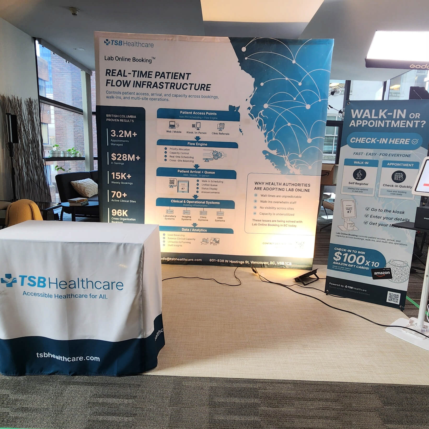
Events & Merchandise
- T-shirts / uniforms
- Event backdrops / step-and-repeat banners
- Signage
- QA review templates
- Design handoff documentation (Figma, Jira)
- SEO blog content
- Event backdrops / step-and-repeat banners
- Signage
- QA review templates
- Design handoff documentation (Figma, Jira)
- SEO blog content
Digital / Web
- Website UI (client portal, design and support development in WordPress)
- Email templates
- Social media assets (Instagram captions + posts)
- Newsletter
- Email templates
- Social media assets (Instagram captions + posts)
- Newsletter